Alaskan Atmospheric River Toolkit
Supported by the National Science Foundation Coastlines and People Program: #2052972
This page contains graphics designed to forecast the presence and strength of Atmospheric Rivers using data from the NCEP Global Forecast System (GFS), North American Mesoscale Forecast System (NAM), Global Ensemble Forecast System (GEFS – v12) and the European Centre for Medium-Range Weather Forecasts (ECMWF) models. For more information on ARs visit the AR FAQs or watch this informational video about ARs.
Deterministic Models: | IWV | IVT | Time-Integrated IVT | Meteograms | Cross Sections |
Ensemble Models: | Landfall Tool | IVT Plume Diagrams | AR Scale |Thumbnails | IVT Probability | Subseasonal Outlooks |
West-WRF: | Ensemble Meteograms |
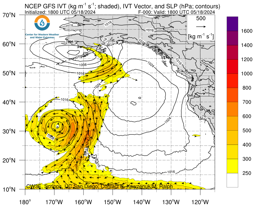
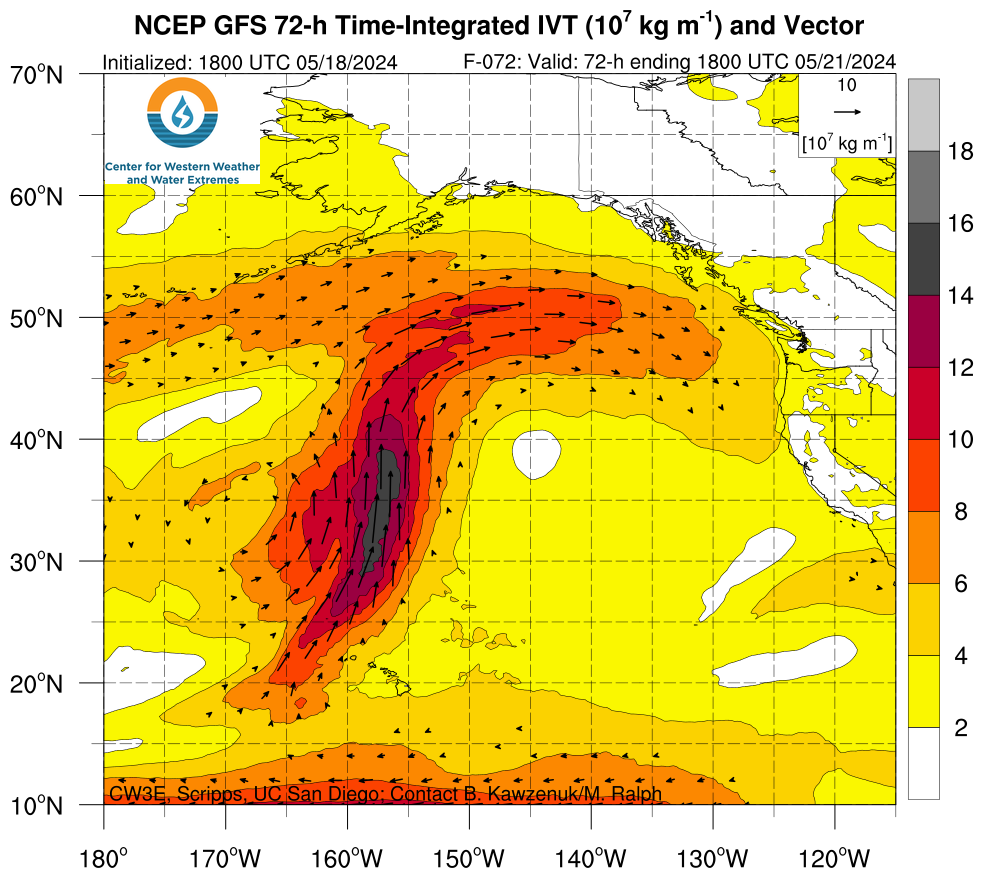
Deterministic Model Forecasts
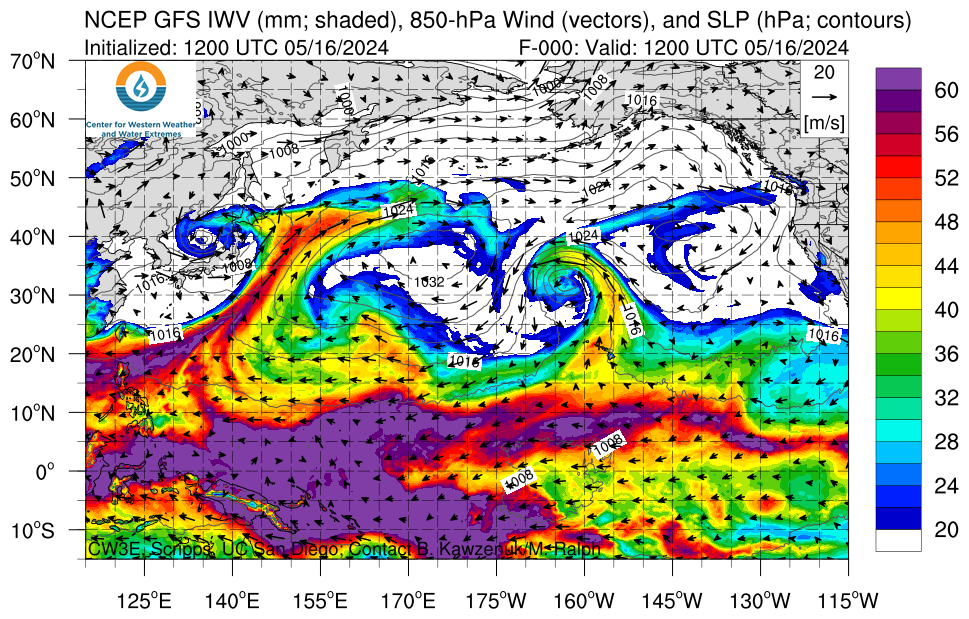
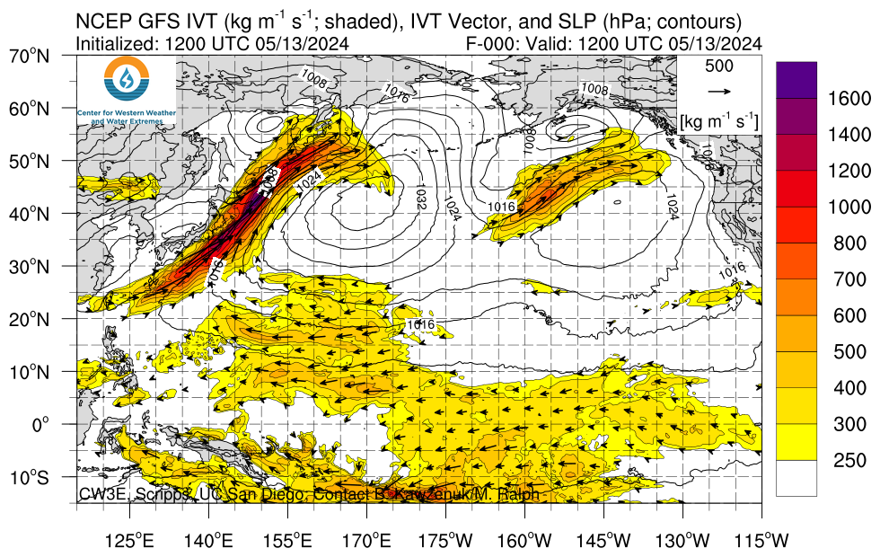
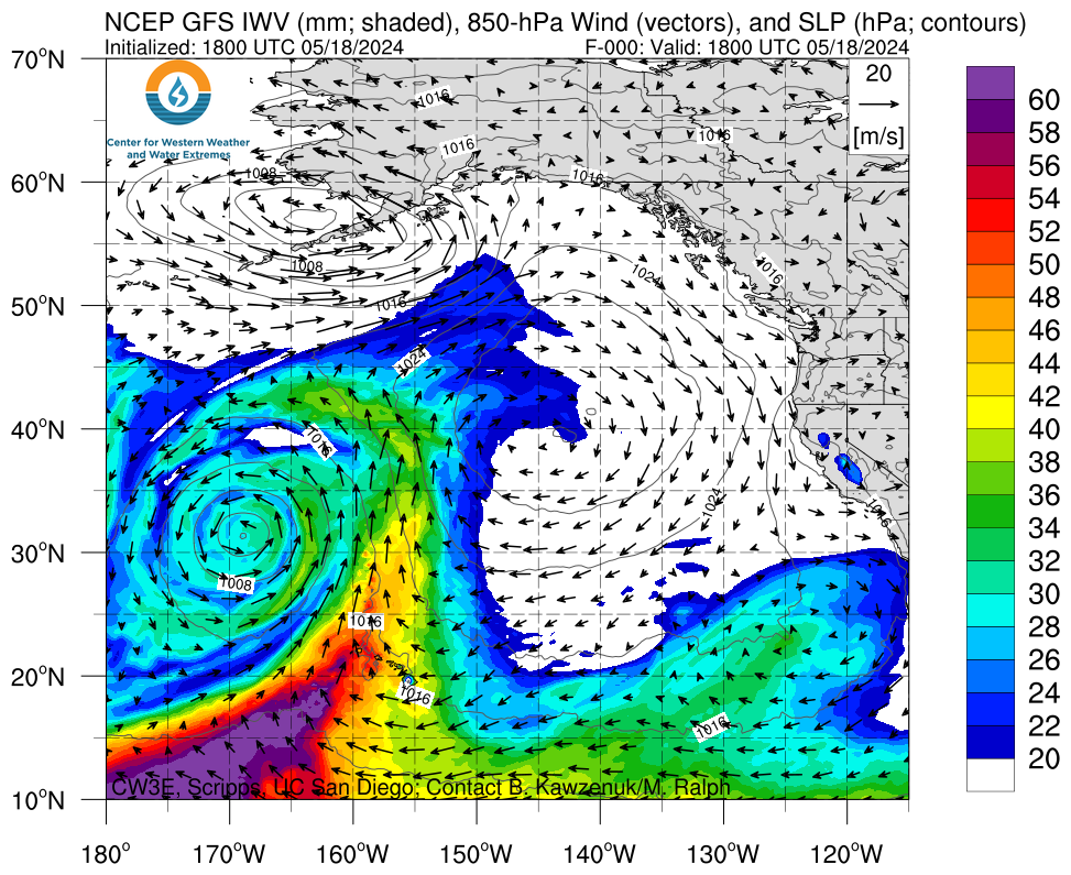
IWV, IVT, and Time-Integrated IVT Click on an image to see forecasts out to 180 hours from the GFS, ECMWF, and NAM
 |
 |
 |
|
 |
 |
 |
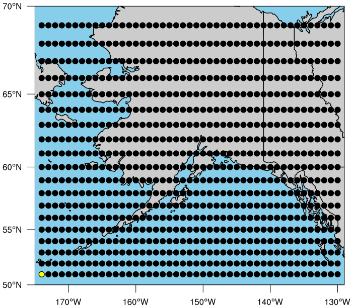
Integrated Water Vapor Transport (IVT) and Relative Humidity GFS Meteograms
These meteograms illustrate the forecasted conditions over a given locations for the 3 or 7-day forecast period from the GFS. The top panel includes water vapor flux (kg m-2s-1) or relative humidity (%) shaded with the 0°C isotherm and wind barbs(m/s), gray shading indicates location elevation. The middle plot illustrates the 3-hour precipitation represented by the bars, total 72-hour precipitation, height of the 0oC isotherm, and location elevation. When the freezing level is below the location elevation, line and bars are blue representing the likelihood of snow and when the freezing level is above the location elevation line and bars are green representing the likelihood of rain. The bottom plot illustrates the IWV and IVT, as well as the presence of AR conditions shaded in gray. The yellow dot on the map indicates the location of the current plot. Click here to view U.S. West Coast domain
Select Type of Meteogram, Latitude and Longitude to generate plot. Click image to open in new tab.
 |
 |
Integrated Water Vapor Transport (IVT) Cross Sections
These cross sections illustrate the forecasted conditions along a longitudinal line from 25-65°N for the given forecast time from the GFS or ECMWF deterministic model. The top panel shows water vapor flux (kg m-2s-1, shaded), the 0°C isotherm (contour), and wind barbs (m/s) and the bottom panel illustrates the IWV and IVT. Black shading in the top panel represents terrain. The dashed lines on the bottom panel illustrate thresholds for AR conditions. The map on the left shows the location of the cross section as well as the IVT (kg m-1s-1) at the forecast time. Gray shading indicates the presence of AR conditions (IVT >250 kg m-1s-1 and IWV >20 mm). Select the model, longitude, and forecast lead time from the menus to see the cross section and click the image to open in a new window.
Select Longitude and Forecast Hour to generate plot
 |
 |
Ensemble Forecast Systems
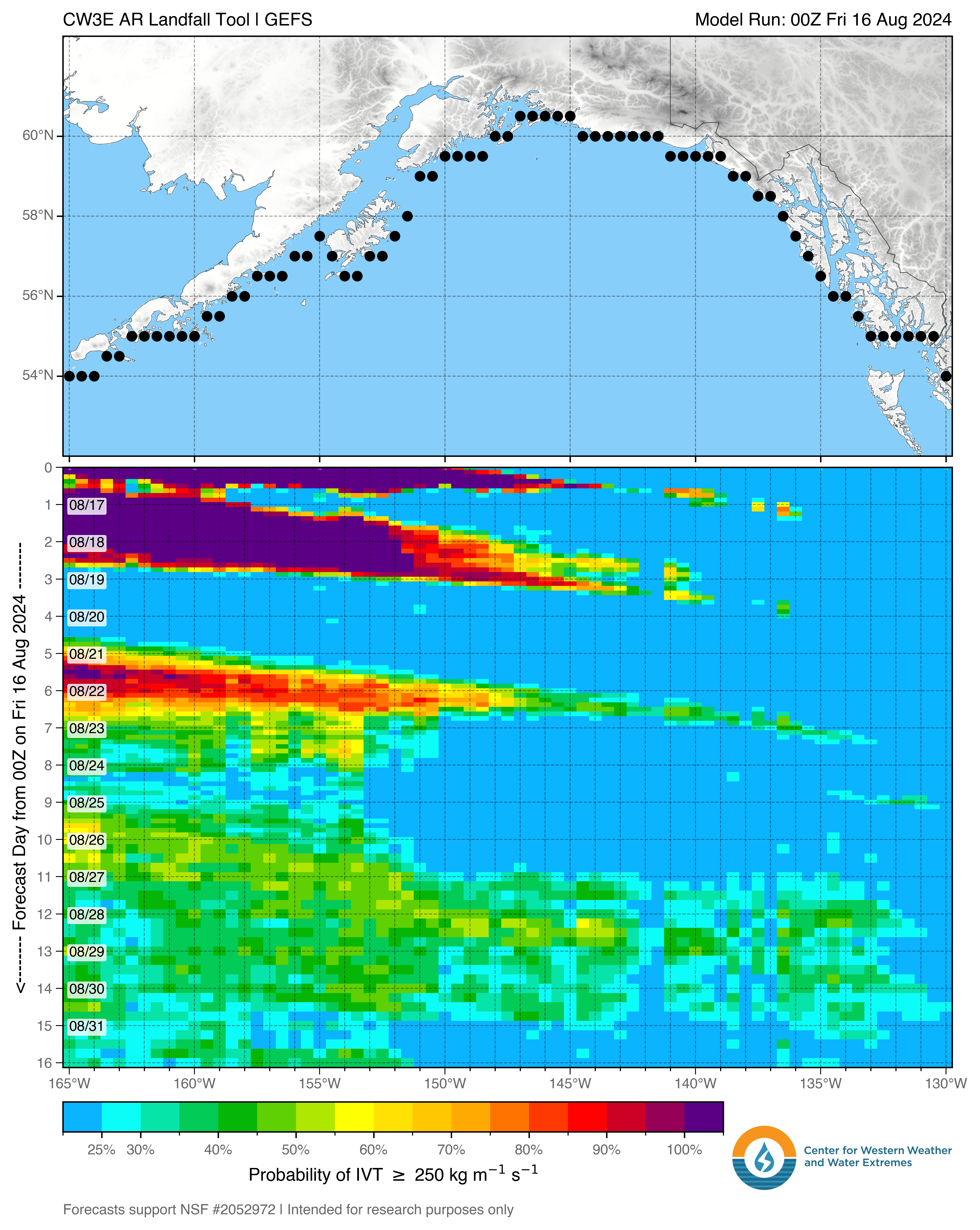
CW3E AR Landfall Tool
The probability CW3E AR Landfall Tool displays the likelihood and timing of AR conditions at each point on the map in a line along the Alaska Coast or inland derived from the NCEP GEFS model over the next 16 days. The probability of AR conditions represents the number of ensemble members that predict IVT to be greater than the chosen threshold at the given location and time.
Select variable or threshold to be displayed, location, and forecast length to generate plot, click image to open in a new tab.
|
dProg/dT |
Alaska IVT Magnitude Plume Diagrams
The plume diagrams below represent the integrated water vapor transport (IVT) magnitude forecast from each of the GEFS ensemble models (thin gray lines), the unperturbed GEFS control forecast (black line), the ensemble mean (green line), and plus or minus one standard deviation from the ensemble mean (red line (+), blue line (-), and gray shading). The dot on the map indicates the location of the current plot.
Select model, forecast length of plot, and location to generate plot. Click image to open in new tab.
 |
 |
Note initialization times may differ between models on individual model plots, all initialization times are the same on combined plots.
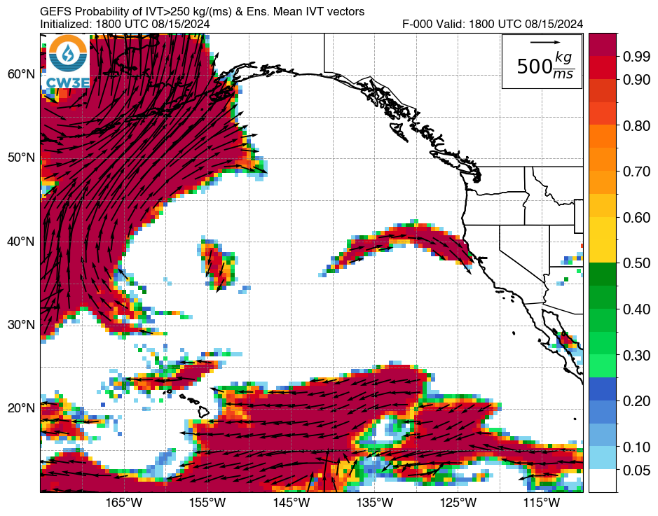
IVT Ensemble Probability Plots
Plot descriptions: Left: Probability of IVT exceeding 250 kg m-1 s-1 based on the 30 members of the Global Ensemble Forecast System (GEFS) and ensemble mean IVT vectors. Right: GEFS ensemble member 250 kg m-1 s-1 contours (thin lines) and ensemble mean (thick blue line).
Select model, forecast hour, threshold, and domain to generate plot. Click image to open in new tab.
 |
 |
Note initialization times may differ between GEFS and ECMWF EPS.
IVT Thumbnail Ensemble Plots
The below images display the 30 members of the NCEP Global Ensemble Forecast System (GEFS); each thumbnail shows IVT (kg m-1 s-1) magnitude shaded according to scale and IVT vectors.
Select model, forecast hour and domain to generate plot. Click image to open in new tab.

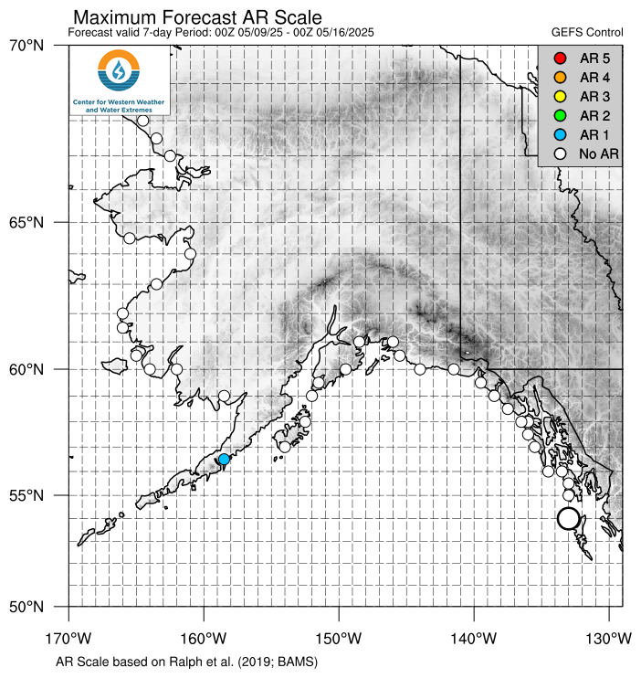
Atmospheric River Scale
The AR scale is determined based on the duration of AR conditions (IVT >250 kg m-1 s-1) and maximum IVT during the AR as described in Ralph et al. 2019. For a description of the AR Scale view the video below.
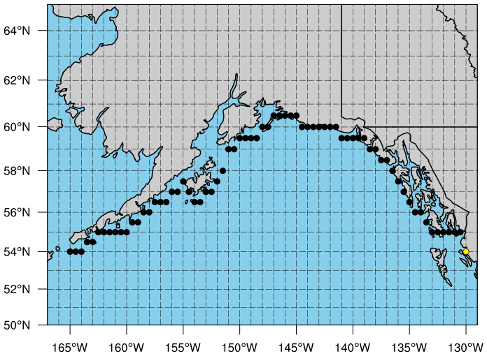
Coastal Maximum AR Scale and Precipitation Maps
The dots on the maps below represent the AR scale observed and forecast at each grid point.
For more information on this product click here to view an overview video.
|
Show Precipitation: |
Model: |
Locations: |

|
Past 7 days (observed) |
Future 7 days (forecast): |
|
 |

|
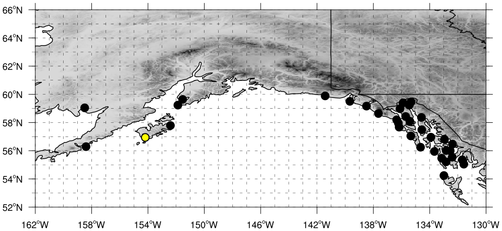
The map on the left shows the AR scale forecasted over the next 7 days from the ensemble mean or control forecast at each dotted location. The largest dot represents the chosen location for the middle and right plots.
The plot on the right shows where each identified AR falls on the AR Scale matrix and how the AR scale is calculated, identified by letters at the top of each AR in the center diagram. Time periods where IVT >100 kg m-1 s-1 but less than 150 kg m-1 s-1 and the duration is less than 24 hours will be represented by gray shading in the center diagram and ◯’s for time periods in the analysis (ie observed) period and X’s for time periods in the forecast on the right plot.
The plume diagram (center) represents the integrated water vapor transport (IVT) and AR scale analysis (ie observed) and forecast.
- The left side of each plot (red date labels) represents the observed (i.e. the 0-hour analysis of the control forecast) for the previous 7 days.
- The right side of each plot (blue date labels) represents each of the individual ensemble models (thin gray lines), the unperturbed GFS control forecast (black line), the ensemble mean (green line), and plus or minus one standard deviation from the ensemble mean (red line (+), blue line (-), and gray shading).
- Colored shading represents the AR scale observed or forecast for the given time, shaded according to scale, calculated using the control forecast or ensemble mean.
- At the top of the diagram each identified AR is given a letter representation (used on the right plot) and the maximum IVT during the AR (kg m-1 s-1), the AR duration (hours), and time integrated IVT (107 kg m-1) during the AR are shown.
- Note that if an AR is currently being observed at the given location (AR shading over the center line), the AR Scale is calculated using a combination of analysis and forecast data.
For more information on this product click here to view an overview video.
 |
 |
 |
Top left: The plume diagram represents the integrated water vapor transport (IVT) forecast for each of the individual ensemble models (thin gray lines), the unperturbed GFS control forecast (black line), the ensemble mean (green line), and plus or minus one standard deviation from the ensemble mean (red line (+), blue line (-), and gray shading). Colored shading represents the AR scale forecast for the given time, shaded according to scale, calculated using the model control forecast. Bottom left: Shading represents the probability of AR Scale conditions at the given location calculated by the number of ensemble members predicting a given AR Scale at each forecast lead time. Top right: Dots on the map represent the maximum AR Scale forecast from the GFS control member at that grid point for the next seven days. Colored shading represents the GFS 7-day accumulated precipitation forecast. The enlarged dot indicates the location the other plots in this diagram are representative of. Bottom right: AR Scale magnitude and timing calculated for each GEFS ensemble member shaded according to scale. Values in shading represent the magnitude and timing of maximum IVT during each forecasted AR. Gray shading in each panel represents IVT >100 (kg m-1s-1) for a duration less than 24 hours.
For more information on this product click here to view an overview video.

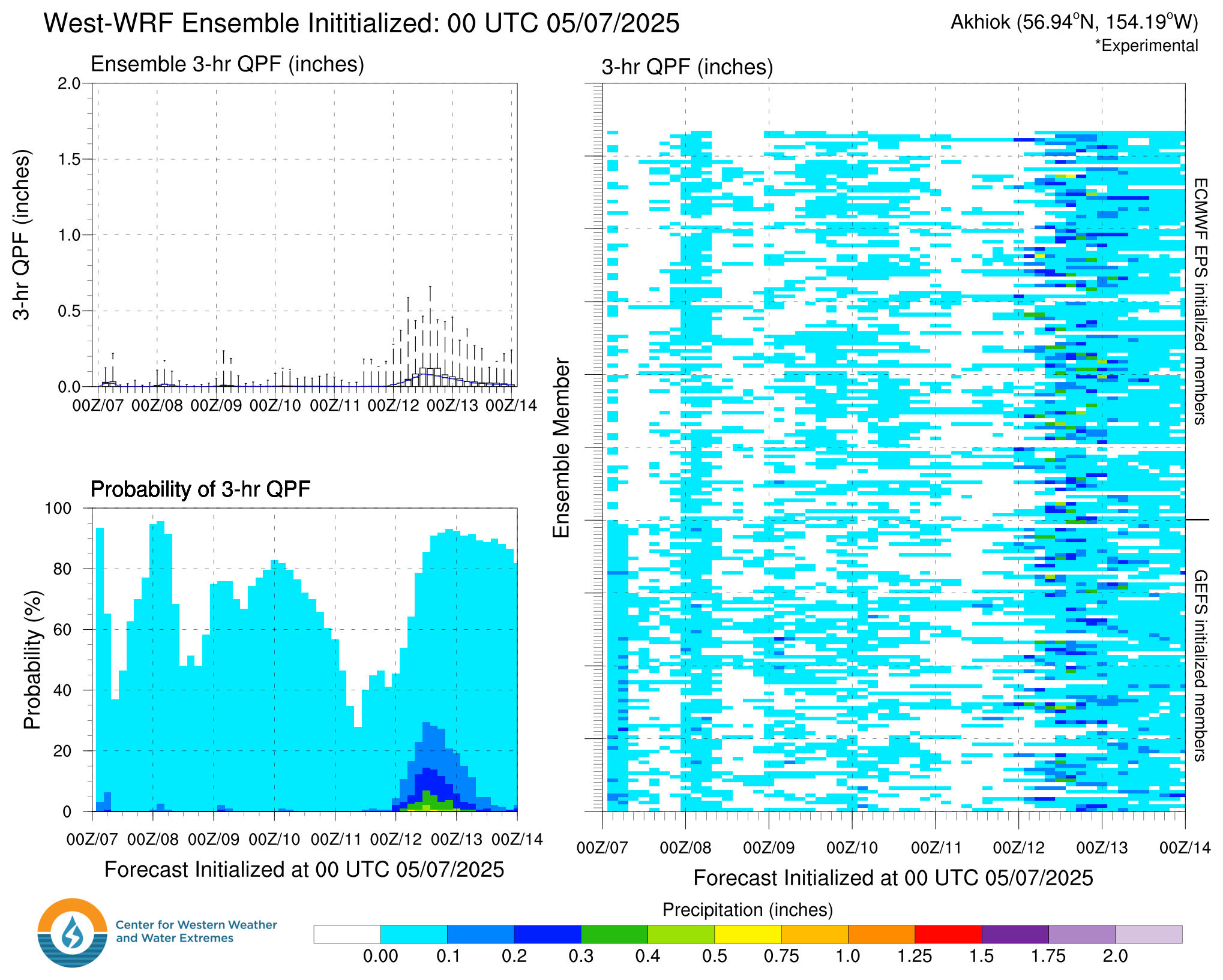
West-WRF Ensemble Meteograms
Top Left: Box plot of 3-hour accumulated precipitation from the West-WRF ensemble model. Bottom Left: Probability of 3-hour precipitation exceeding various thresholds (threshold defined by colorbar on bottom) calculated by the number of ensemble members predicting precipitation over each threshold at each forecast lead time. Right: Three hour accumulated precipitation from the each ensemble member shaded according to scale valid at the chosen location. Gray shading represents missing data.
 |
 |
Subseasonal Forecasts (Weeks 1-3)
Dynamical Model Atmospheric River Activity Forecasts
A multi-model experimental forecast for AR activity (defined as the # of AR days per week) at week-1, 2, and 3 lead time is shown below for the NCEP dynamical model.
This product was developed in collaboration with NASA’s Jet Propulsion Laboratory.
Weeks 1-2: Shading indicates the odds of AR activity for each day. ARs are defined using the Guan and Waliser (2015) algorithm and probability is calculated by the number of ensemble members predicting an AR at each grid point at 00 UTC on the given forecast day. Click on a panel to open in a new tab, click on title to open seven day panel plot.
Week 3: The top row shows the forecast number of AR days during week-3; the middle row shows the climatological values of AR activity in each model’s hindcast record for the week-3 verification period; the bottom row shows the departure of the AR activity forecast for that same verification period (top panel forecast minus middle panel climatology). For this row, blue values represent higher than average AR activity predicted during week-3; red values represent lower than average AR activity predicted during week-3. Grey rectangles surround grid cells where >75% of forecast ensemble members agree on the sign of the AR activity anomaly with respect to climatology. These regions can be interpreted as having higher confidence in their prediction of week-3 AR activity. The hindcast skill assessment associated with the NCEP, ECMWF, and ECCC hindcast systems is described in DeFlorio et al. 2019b.
|
|
|
|||||||||||||||||||||